The Maltese government’s official Twitter and Facebook accounts published an infographic claiming that petrol is “cheaper in Malta than anywhere in Europe” on 1 August, despite it being an outright lie.
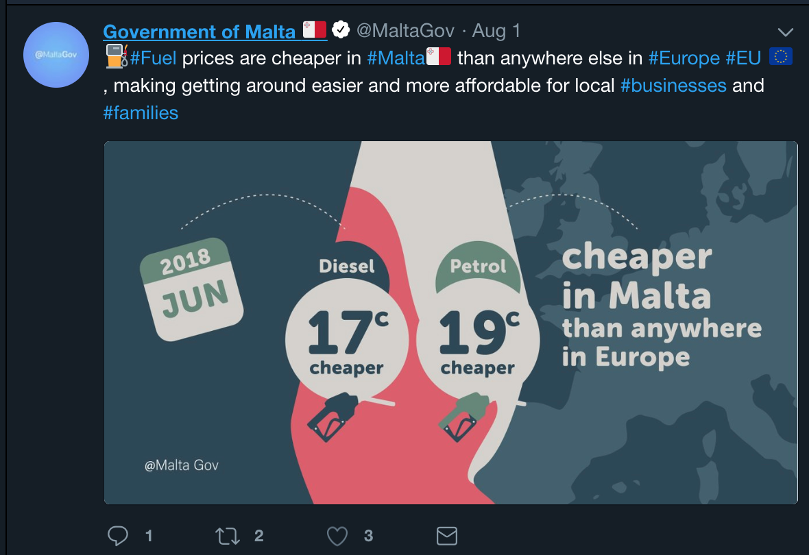
As of June 2018, the date specified in the government’s infographic, there were nine EU member states in which the price of petrol was lower than Malta’s, ranging from 13.2% cheaper in Bulgaria to 0.1% cheaper in Latvia.
The latest petrol price data, for July 2018, rank Malta in the same relative position, with the same nine countries registering cheaper petrol prices.
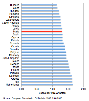
When it comes to diesel prices, here too the government is lying within the same infographic. The June 2018 data show four EU member states where diesel prices are lower, ranging from 0.7% cheaper in Lithuania to 5.3% cheaper in Luxembourg.
The latest diesel price data – for July 2018 – rank Malta in a worse position, now with eight countries registering cheaper diesel prices, ranging from 10.5% cheaper in the Czech Republic to 0.6% cheaper in Italy.
Government officials and Labour MPs retweeted the infographic, but others challenged it.
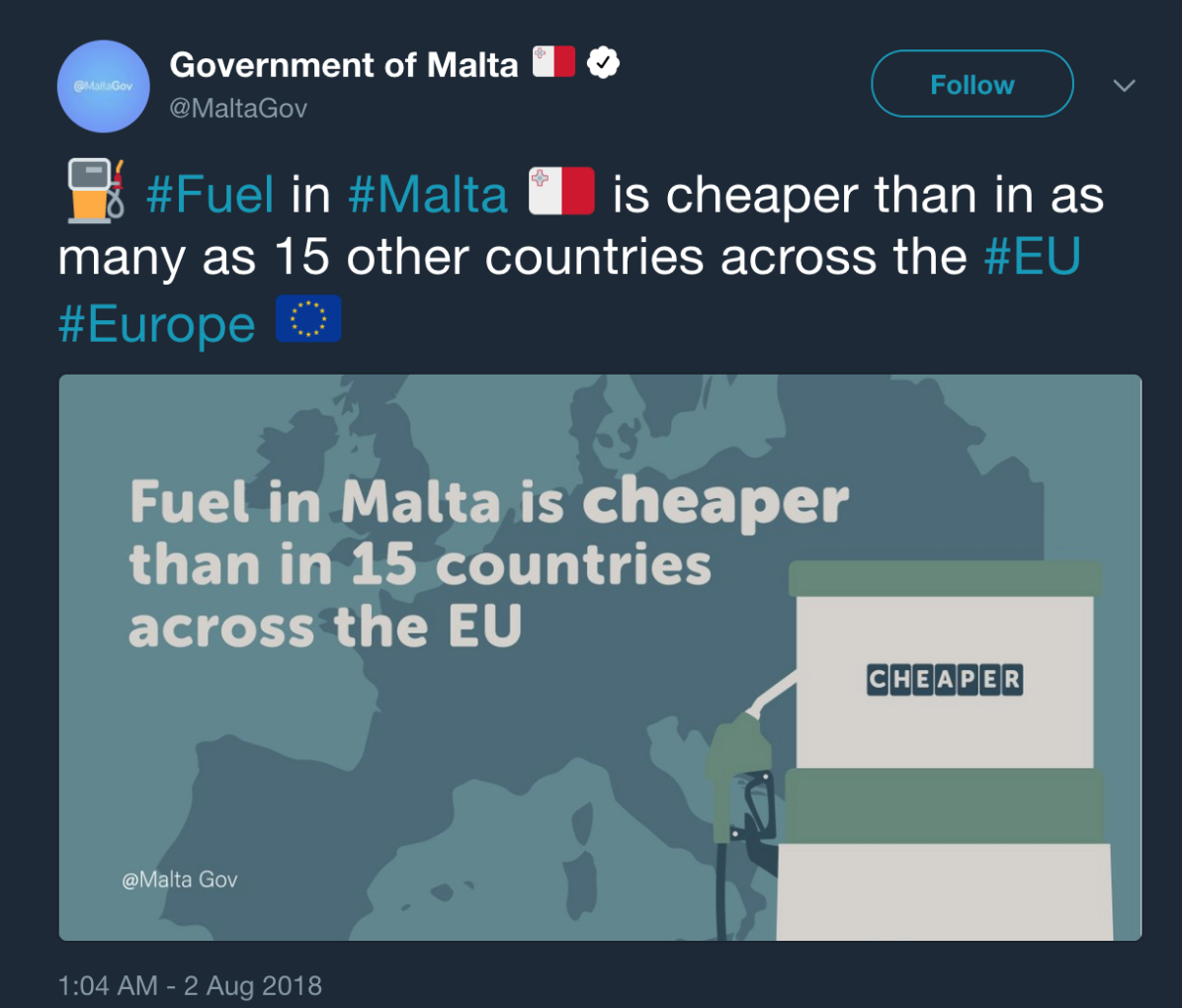
The government’s reaction was not to apologise and retract the infographic, but to leave it online without a correction, and quickly publish on the following day another infographic that looks the same but now claims: “Fuel [Diesel? Petrol? Gas? Oil?] in Malta is cheaper [June? July? When?] than in 15 countries across the EU”.
Style over substance
That the government uses a wide range of disinformation techniques to mislead and outright lie to the public is no longer news and has been the basis of The Shift News’ Disinformation Watch for the past two months.
But the government’s disinformation campaign is now being enhanced with its use of slick, authoritative-looking yet utterly false infographics.
The petrol example is one of countless others.
The government recently published an infographic with the claim of “a reduction in government debt” (tnaqqis fid-dejn tal-gvern), accompanied by the hashtag “#5snintarizultati” (#5yearsofresults), overlaid onto a pair of scissors cutting through a red box with “debt” written on it.
In reality, total general government debt increased by 10.2% from March 2013 to March 2018, according to Central Bank figures. It now stands at €5.69bn.

Lying about success
The government published additional petrol infographics on 2 August. One claimed that Maltese people are paying less for their petrol and diesel since March 2013 “thanks to @MaltaGov’s #energy policy which ensures price stability and peace of mind”.
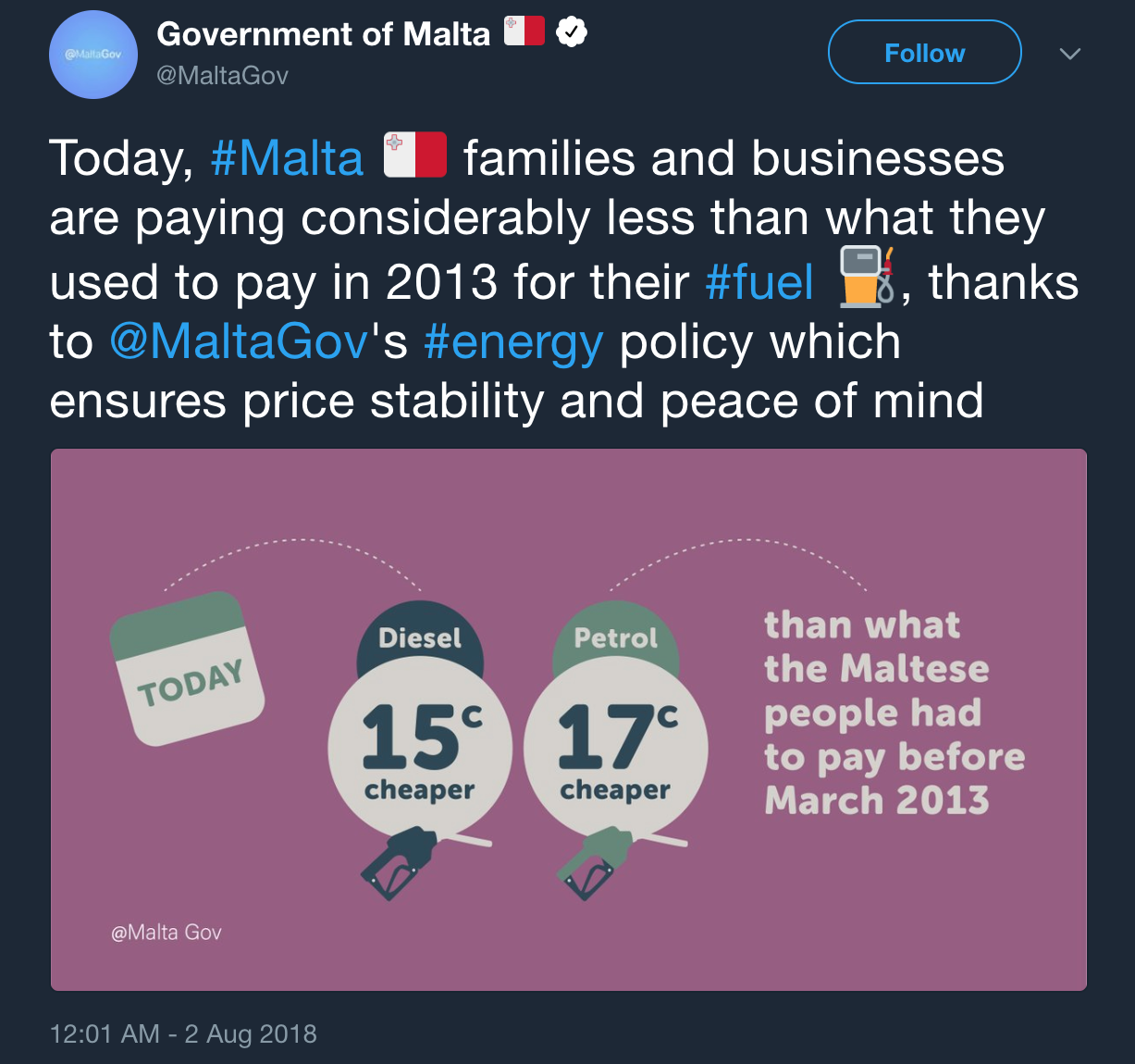
The government can in no way take credit for lower petrol or diesel prices. The €0.17c drop in the petrol price that it is celebrating, equivalent to an 11.5% drop from February 2013 to July 2018, is in fact smaller than the EU market drop in the petrol price.
In the EU market, the price of petrol fell by 19% – a sharper fall than Malta – over the same period. The price of diesel also fell by 19% over the same period.
In turn, this drop in the price of petrol and diesel has everything to do with the collapse in the global price of oil over the past five years and nothing to do with Malta’s policy on petrol.
The government’s energy policy more broadly is, in fact, increasing the price of energy in the country, with experts saying that Malta’s gas imports from Azerbaijan are losing Malta money “hand over fist”, the government having paid nearly twice the open market rate for gas from Shell via Azerbaijan.
No data sources
The government and its officials publish infographics without any data sources or references, expecting its audience to take what it says as fact. Tourism minister Konrad Mizzi is especially guilty of this.
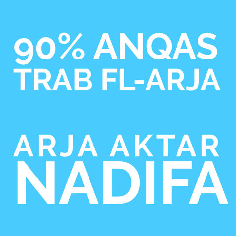
Mizzi published an infographic – a GIF that flashes from “90% less dust in the air / cleaner air”, to “Delivering what we promised”, and ends with “KONR>D MIZZI”. Yet, the statistic was published without any source or detail.
We can’t know:
- Where the data come from
- What “dust” it refers to (is it pm2.5, pm10?)
- What period the 90% drop was calculated over
- Where measurements were taken, how they were taken, by whom and what area they refer to
- Whether KONR>D MIZZI and his policies had anything to do with it.
The “90%” statistic, implying an almost total reduction in “dust” in the air, is hard to believe and impossible to verify. It is a case study in the deceitful use of statistics.
No context
The government publishes infographics that provide no context to statistics. This is done to both mislead the public on the correct interpretation of the statistic and to also make it impossible to verify the statistic itself, allowing the government plausible deniability.
One government infographic plasters “17% growth in exports in 2016” over a container ship.
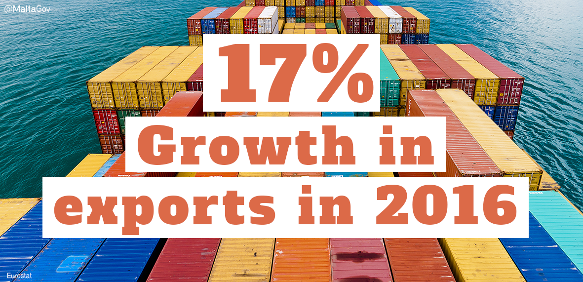
It is difficult to uncover what export measure the government used here. The standard measure is ‘exports of goods and services in constant local currency unit’ (LCU) – that is, total exports adjusted for inflation in the country’s own currency. Going by this standard measure, Malta’s export growth in 2016 was 3.5% – a far cry from 17% – and lower than both 2015 and 2014.
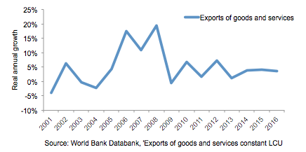
Going by the standard measure of exports, export growth has actually slowed down between 2013 and 2016 compared to previous years.
All this begs the question: If this is such a successful government, why does it need to resort to lies to convince the public of its achievements?

